In 2007 MacPhail Center for Music was about to celebrate their 100th anniversary and move into a new building of their own. It was a perfect time to update their branding to reflect their current and growing future education, therapy, and community outreach programs.
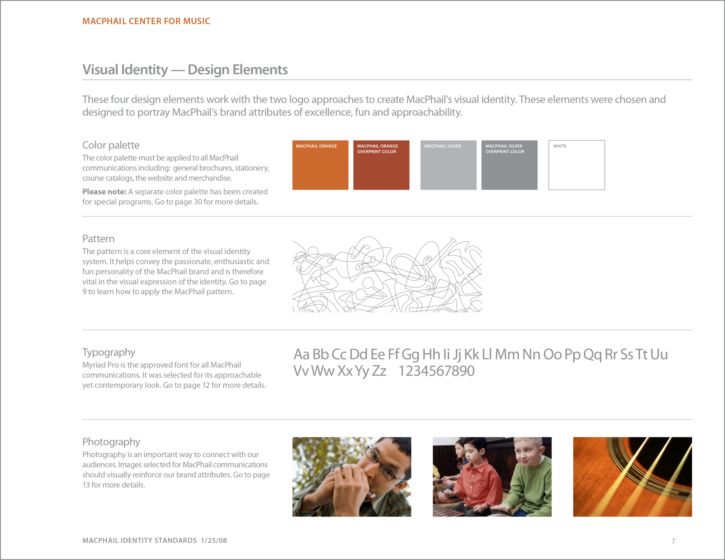
With the brand redesign, MacPhail got a new logo, signage, stationery and comprehensive branding guidelines. A unique design element is a playful yet sophisticated illustrated pattern of intertwined instruments. The pattern is a cornerstone of the identity system, and was so beloved by one student that she had it tattooed on her arm.
Opening gala invitation and materials are large, lively and celebratory. The die cut of the invitation reflects the new building’s unique architectural design elements.
Since implementation of the new brand, MacPhail has added four locations, programing has grown from 8,200 to 16,000 students, and increased financial aid for students from $300,000 to $1.2 million.
Creative Direction • Design • Brand Strategy • Brand Strategy • Illustration • Writing • Brand Guidelines • Production
Cargill wanted a new look when they launched their new business strategy. The updated logo and identity guidelines were extensive yet made to be easy to follow and apply across a multitude of assets. New stationery, signage, packaging, advertising, and literature systems were provided as downloadable templates.
A new master branding strategy was applied to Cargill's extensive portfolio of products and services to make it easier for individual business units to apply the brand more consistently.
Lead Designer • Competitive Audit • Product Branding Strategy • Identity Guidelines • Writing
Stir Creative updated the visual brand identity for St. David’s Child Development and Family Services. The new identity needed to support the organization’s new strategic plan including its updated mission, vision and values statements. Stir Creative worked alongside Kim Baker (marketing consultant) to develop a cohesive visual identity and marketing plan to increase community engagement.
We made an adjustment to the name for clarity, created a new tag line, and provided branding guidelines.
Returning to a heritage look was the strategy to strengthen the brand beloved by cooks and bakers. Every element of the new packaging received an update, including the Spice Islands logo. Reconfiguring the filigree, applying a warmer color palette, color coding for differentiation of product categories, and new lush watercolor illustrations gave new life to the Spice Island brand.
Art Direction • Photo Direction • Logo Development • Product Brand Strategy • Packaging Design
Aleatico Wine Label
Aleatico is a sweet Italian dessert wine. The label was designed to embrace the elegance and romance for the moment the wine would be served. Hand lettering and illustration complement the lovely shape of the bottle, Botticelli's illustration, and the beautiful color of the wine.
Awards: Communication Arts 1990 Design Annual
Art Director • Illustration • Hand Lettering • Production
Applied new identity to packaging concepts elevating and strengthening the brand for frozen entrees, soups, breakfast cereal and deli meats. Directed photography and food styling, and developed and wrote a standards manual for the new identity and packaging.
Art Direction • Photography Direction • Illustration • Writing • Product Branding Guidelines
Public Awareness Campaign:
Earned Sick and Safe Time Law
In 2017 the City of Saint Paul, Minnesota enacted a new law that affected employers and employee within the city. Known as the Earned Sick and Safe Time law, it stated that employers in Saint Paul must provide employees working in Saint Paul with paid leave for medical or safety reasons. The ESST acronym became a strong and bold logo-like design element that was applied to transit stop posters, train wraps and workplace notices.
With Neka Creative — Creative Art Direction • Design • Production
Awarded recognition in the 2018 Graphic Design USA Design Issue
Candles can create transcendent experiences, graceful ambiance, and make elegant gifts. Niven Morgan scented candles are designed to be sophisticated gestures of generosity and kindness.
It was desired to have sophisticated packaging that would appeal to men and women, with a box that could be repurposed.
We explored sumptuous vintage textiles, wall coverings, and tile patterns from exotic places. To provide a modern note and to complement the Niven Morgan logo, we used a sans serif font with generous clear space.
Creative Direction • Competitive Audit • Product Brand Strategy • Illustration
With “Design Elements” as the theme, we created a ‘chart of design elements’ that were playful, colorful and witty. These graphics were applied to invitations, programs, sketch books, coasters, name tags, shirts and hats. The graphics and materials were well received by the Minneapolis design community. Whew!
Lead Designer • Photography Direction • Writing • Production
When 3M had the opportunity to sell their their line of Fire Barrier caulking at Home Depot, they wanted to improve their branding and packaging. This new design clearly shows and states the differences between each product using color coding and illustration on the front of each tube.
Lead Designer • Product Branding • Packaging • Illustration
College of Food, Agricultural and Natural Resource Sciences (CFANS)
Initially, CFANS wanted help to design a few publications. Now, in an expanded consulting role, I am helping the CFANS creative and communications team to explore, establish and implement a new branded look.
Creative Direction • Brand Strategy • Brand Development • Marketing Communications • Templates • Banners • Event Graphics • Award Certificates • Video Direction.
People of every age love to color Mystery Mosaics color-by-number puzzles. Each coloring book contains 18 mosaics, five of which are 10" x 17" fold-out pages.
The mosaics have astonishing detail and are a delightful array of imagery that include flora, fauna, food, sports, landscapes, modes of transportation, and mythological creatures.
This project came to life when MindWare commissioned Stir Creative to develop a series of coloring books using mosaics as the theme. The first books were so popular, we had to make more!
Creative Direction • Illustration • Production